Why Learning Scoop is called as Learning Scoop?
We have got many questions about our company name; where does it come from and what does it represent?
 When we decided to start running a company which would export Finnish education practices abroad , we faced a number of difficult decisions; company form, stakeholders, partnerships, vision, strategy, mission, graphic expression, font, business cards, budget and of course the name and logo – the most difficult decisions.
What can be the name of a co-operative looking for the best practices in education in Finland and abroad trying to cross-pollute them and to organize educational visits to those interested in Finnish education?
In English, co-operative is abbreviated as “coop”. In newspapers, news stories and in journalism, the news and the exciting news story is a “scoop” in English. As we are searching and discovering for the best, interesting practices in the field of learning and education, we could be Learning Scoop.
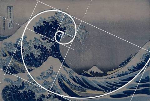
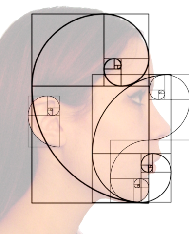
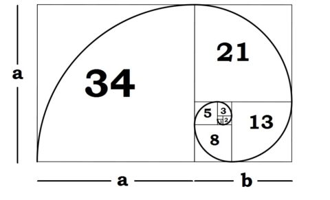
We found a pretty good name, and we started designing the logo. We looked at pictures of various “scoops” – ice cream buckets and other shovels, but they did not generate the feeling we were looking for and a link to learning was missing. In one of the ice cream pictures, however, the ice cream formed a spiral, a mathematically clear pattern. The picture seemed harmonious and brought to mind the golden ratio of the mathematical graph. The mathematical string of golden ratio is called Fibonacci. This makes sense, now there is a link to learning!
 Leonardo Pisano (association to world famous PISA results? 😉 ) was an Italian mathematician, known as Fibonaccina, a middle-aged scientist (1170-1250) who wrote down the mathematical string of golden ratio. People have been interested in golden ratio already before Fibonaccia. The proportions of the Greek temples and archaic sculptures are based on golden ratio and the very old art has been striving for the same harmony. Later the same ratio was used, for example, in Notre Dame Cathedral.
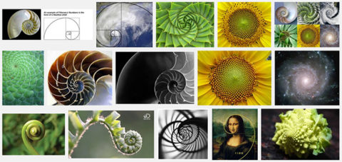
The ratio itself is interesting and aesthetic because it is very often seen in biological nature, plants, animals, human dimensions etc.
The idea of our logo was sketched, I drew the first versions with a pen, and then I moved to the brush. I wanted to leave my fingerprint on the logo, which was not that easy. I will never forget that moment at my summer cottage in August 2014. The final version was created in Hämeenkyrö, in the picturesque childhood settings of a Finnish literary Nobel Laureate, F.E Sillanpää. The sketch is still in the drawer.
We were extremely pleased: we had a name and logo to represent the visual image of our company.
Juha
![]()
All pictures are found on Google by “Fibonacci Golden ratio”. Try it yourself too?